Pointouch is a new software as service POS Software that aims to make the lives of employees and managers much more manageable by good UX and bringing all of the work functions into the software.
Role
UX designer designing an app from conception to delivery.
Responsibilities
Conducting research, paper and digital wireframing, low and high-fidelity prototyping, conducting usability studies, and iterating on designs.
Duration
October-December 2023
Problem
Current POS softwares on the market are not thorough enough to meet all work requirements, employees usually need more than one platform for their work. Many of them are outdated and difficult to use.
Goal
To design a POS Software that every employee and manager could use while making it easier for them to communicate with each other. Gathering all required processes of retail and cafe work into one system, leaving no need for other softwares or websites.

Research
I have interviewed multiple retail stores and coffee shops (employees and managers) and asked them general questions about their experiences with POS systems. I have avoided restaurants because initial basic research before the interviews showed that they required a very different software structure than the other two, which were pretty similar.
Here are some of the questions I've asked during the interviews:
"What feature(s) would you like to see in a new POS software?"
"What other technologies and programs are you using alongside the POS, and can you explain their functions?"
"What are your favourite features of POS systems and other programs you have used?"
"What are some of the common problems you have encountered with POS softwares you have been using?"
Personas
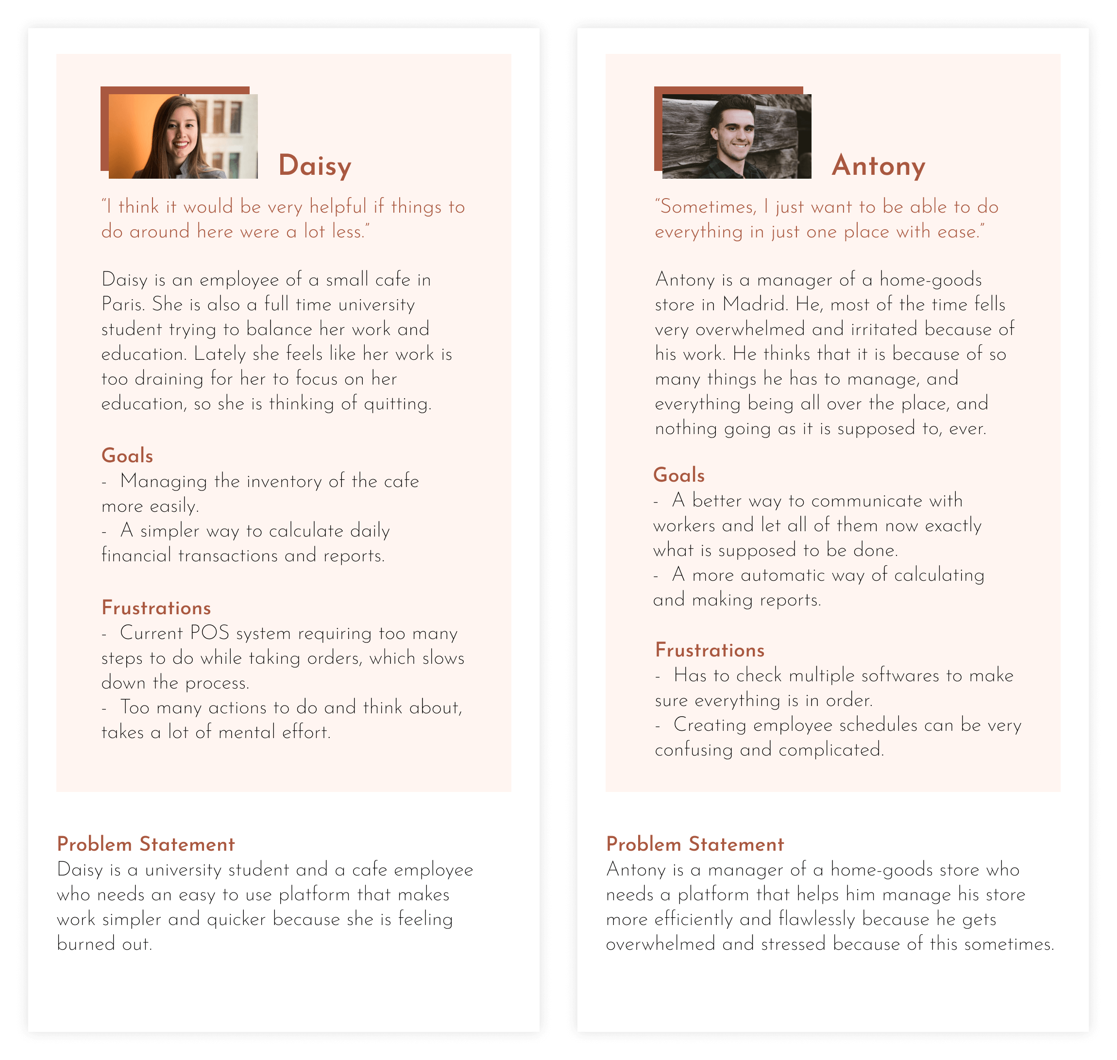
In both coffee shops and the stores, employees had similar wishes and problems. Meanwhile, managers' issues were similar to each other but different from their employees. That is why I have divided personas into two categories, employees and managers.
User Journey Map
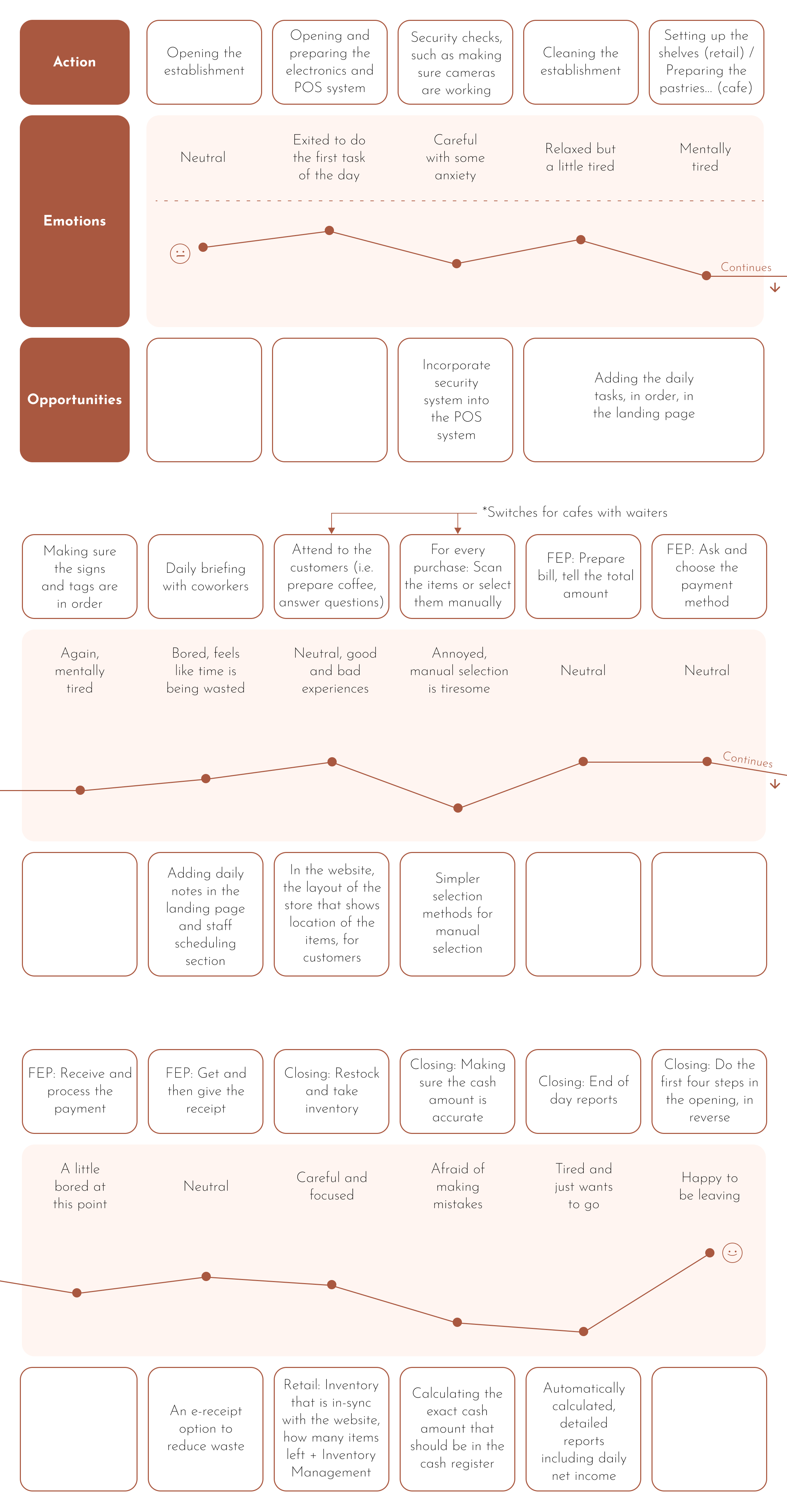
The user journey map of both coffee and retail shop employees combined. Day-to-day includes lots of small and some big tasks that, when added up, do have a tendency to mentally drain a person. Something that could be done about this is to have daily routine and singular occurrence lists, among other things that are shown here.
Competitive Audit
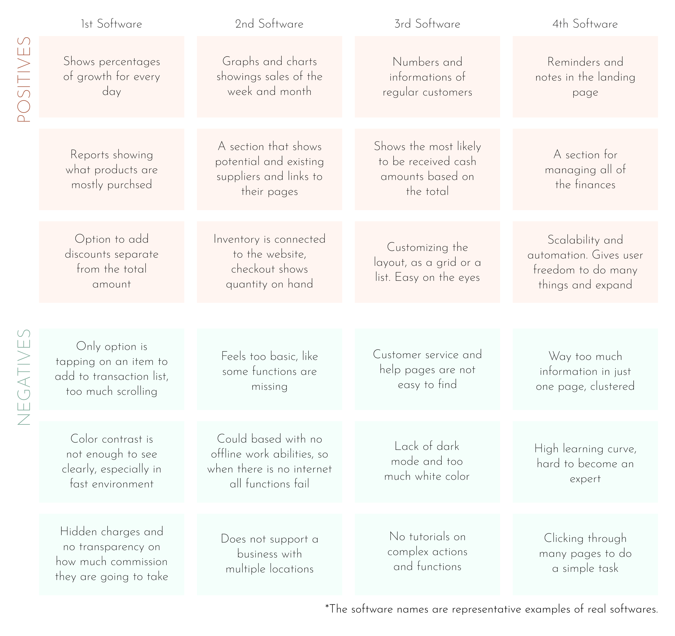
Since these types of software are paid software for specific purposes, it was hard to find good quality free versions. So, I've downloaded the trial versions for the competitive audit or used their online demo versions. I've also looked through the comments, criticisms and good remarks that were made about the software.
Ideation
The features that should be included in the software were determined in the research phase. It included: An optimised checkout process, an easier way to manage the inventory, an incorporated security system, to-do lists, employee group chats, etc. These features came to life in a basic form in this ideation section.
Sitemap
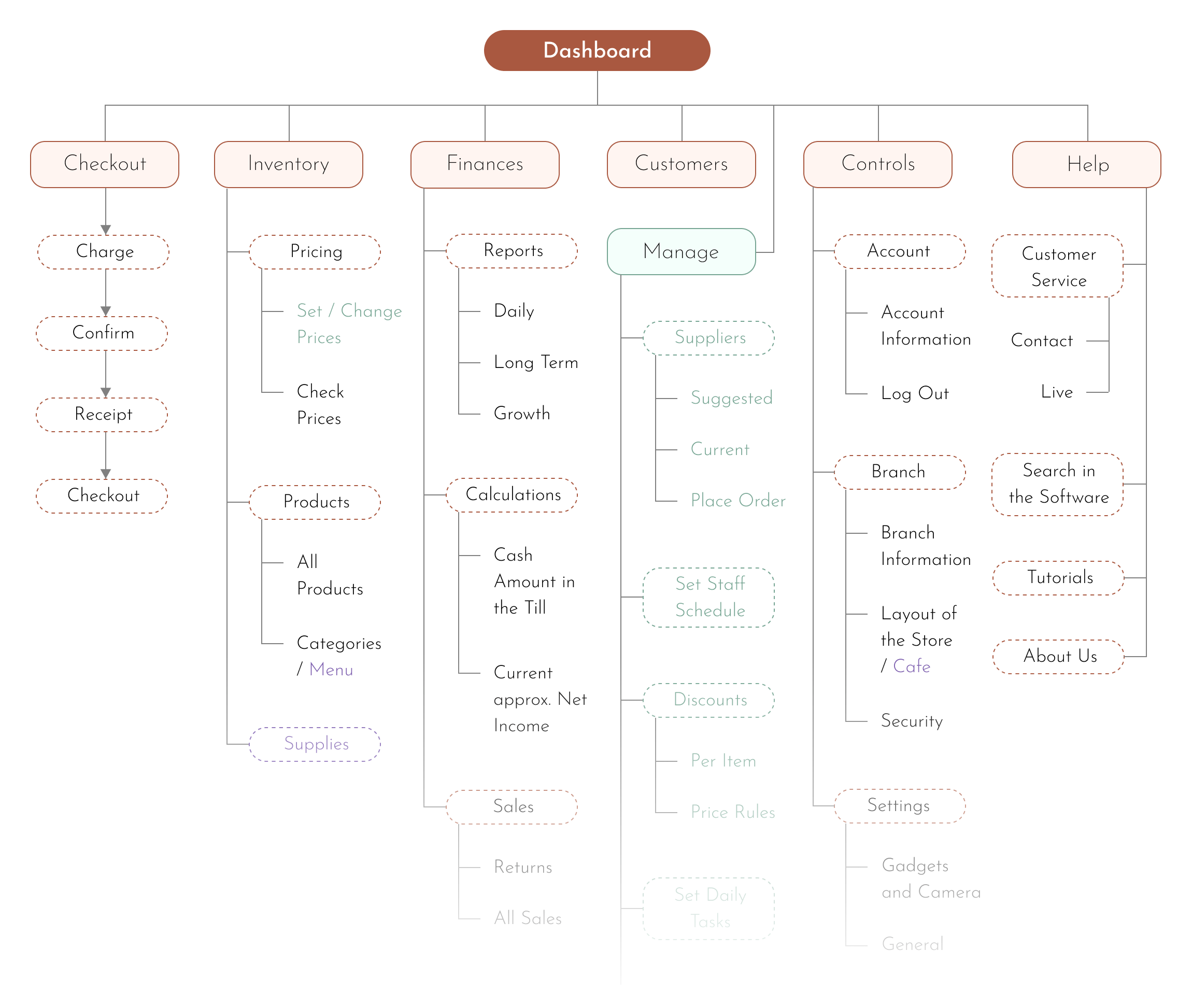
There are six main branches of the hierarchical structure of the software: Checkout, inventory, finances, customers, controls, and help. By its nature, checkout had to be in a sequential structure within its branch, different from the other main branches. There is also a seventh branch, only accessible to the managers, allowing them to do manager-specific tasks.
User Flow
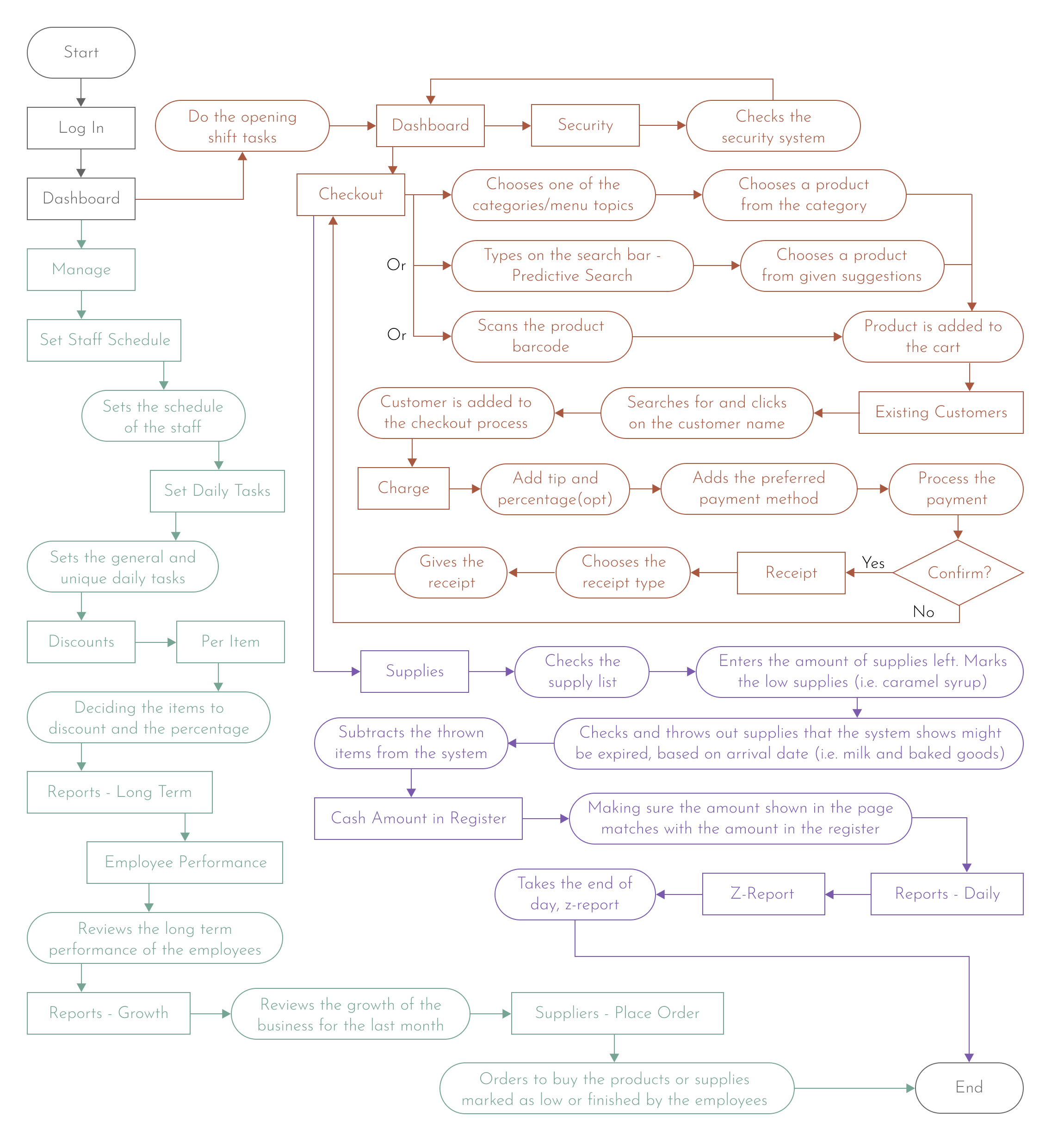
Here are the user flows for the opening shift and the checkout process in brown, the closing shift in purple, and the manager's process in teal. The user flow is the same for both the retail store employees and coffee shop employees. The user flow for the coffee shop employee was made based on the assumption that the coffee shop would be functioning as a takeout or a self-serve coffee shop, where workers would be behind the counter. It would be a whole other project (with a very different user flow) to make a POS software for places where servers are involved, like restaurants, so it was avoided.
Crazy Eights
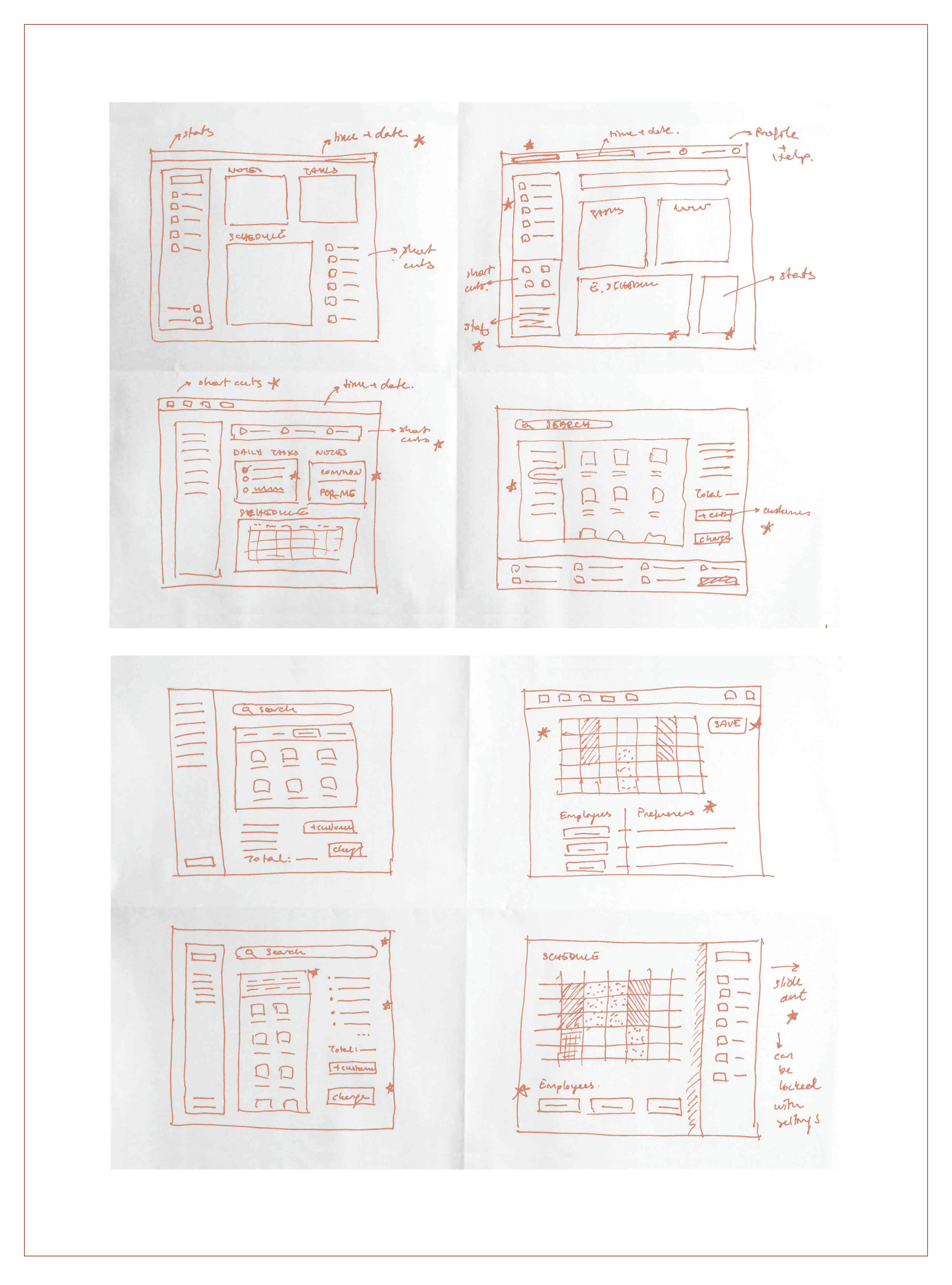
During the crazy eights exercise, I mainly focused on the location and the geometry of the navigation menu, the layout and contents of the homepage, the general idea of how the checkout page will be, and the design of the schedule setting process page. The idea of a shortcut buttons menu was formed at this time.
Low Fidelity Design
In the low fidelity section, different features of the crazy eights exercise were combined in the sketches, and some additional frames were added. During the wireframing phase of the sketches, it was discovered that the proportions of the sketches did not properly match the proportions of a real tablet. So, the proportions were adjusted accordingly, and more frames and features were added. In the end, it all came together with the prototype, and the missing links that connected wireframes were designed.
Sketches
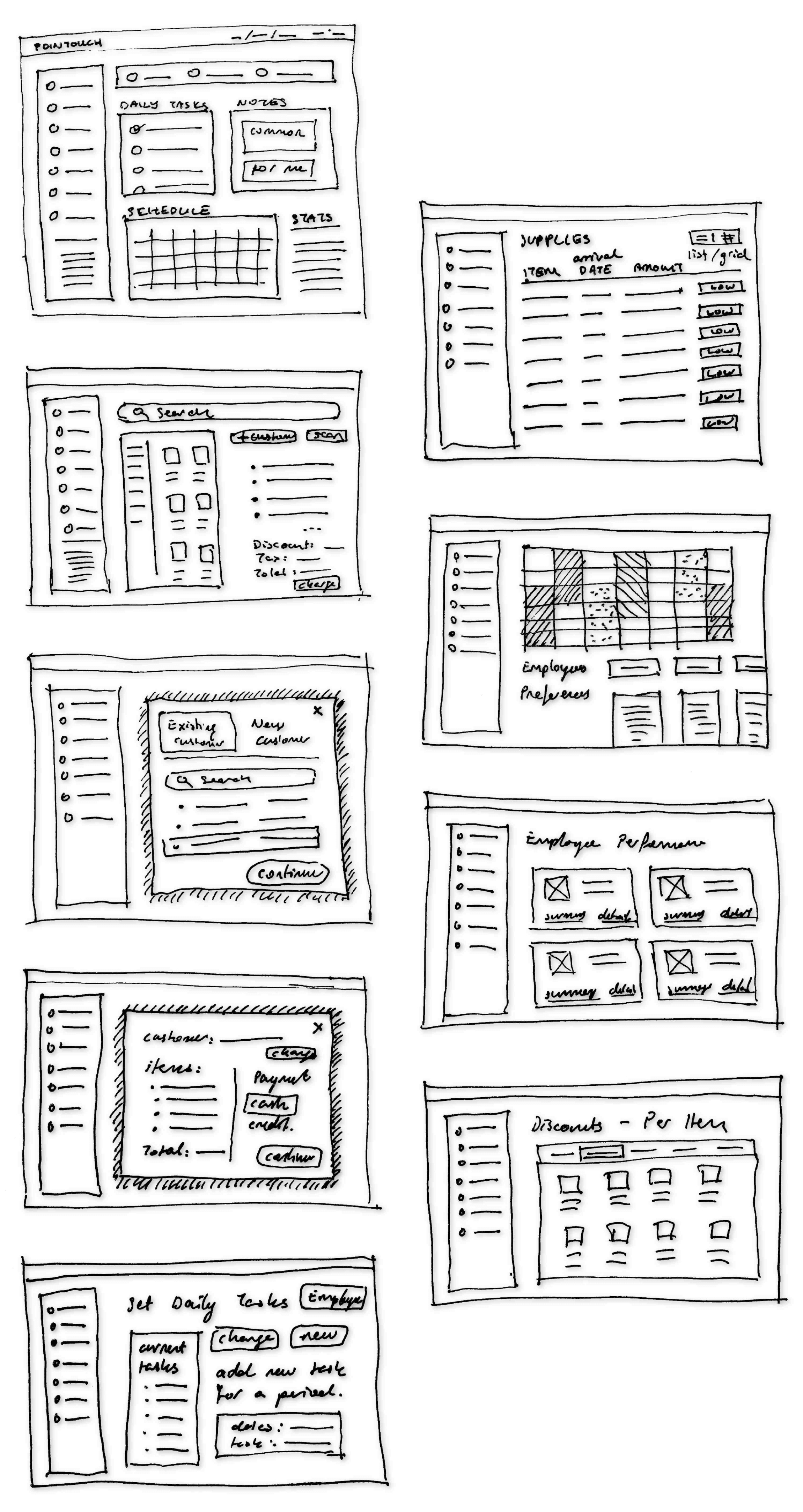
One of the debates in my mind while doing the sketches was whether it would be better to put statistics at the bottom of the navigation menu or not, statistics being things like how many items are sold today. This debate will be resolved at the later stage, the wireframes. As I kept drawing, more ideas started to flow and the number of sketches grew. In some sketches, overlays were symbolised by adding shading around the desired overlay shape.
Wireframes
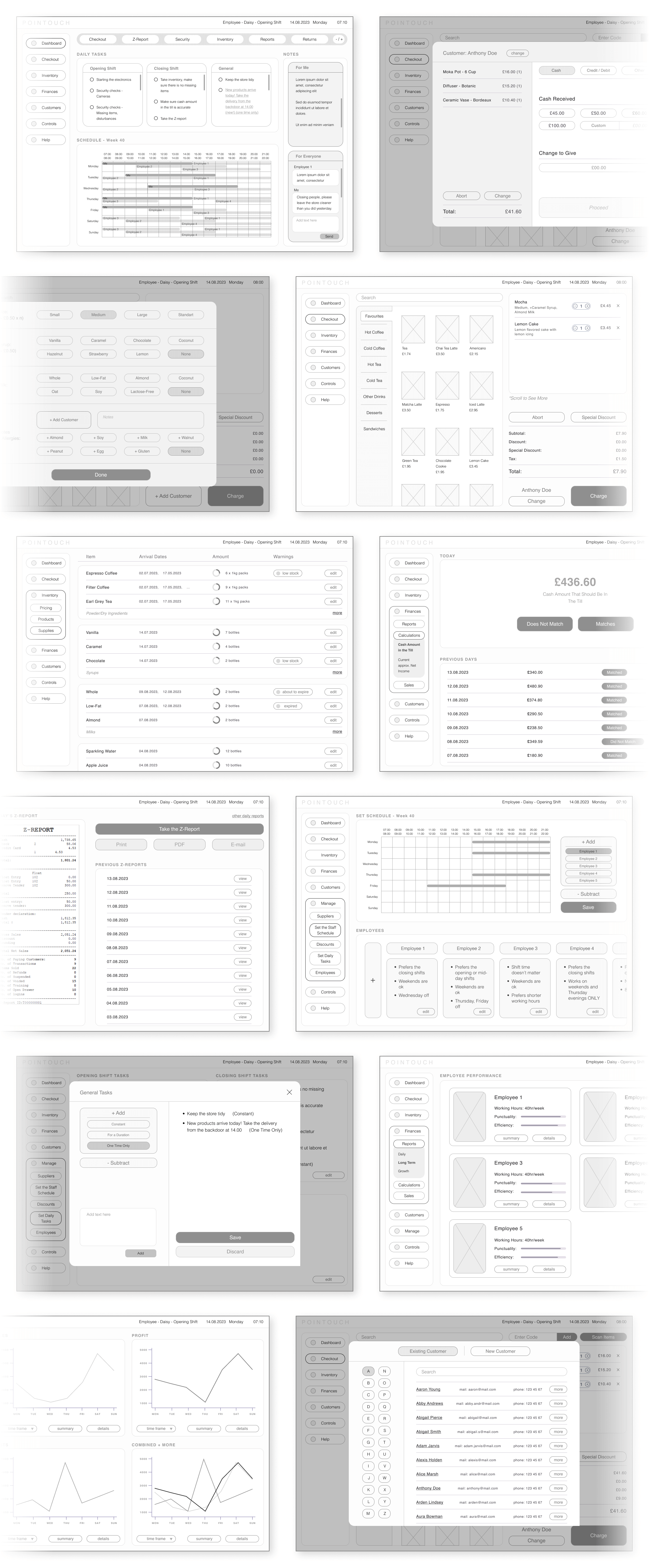
Wireframes provide a more realistic perspective of the conceptual design by reflecting what is feasible and what is not. During this stage, I realized that the initial sketches were too abstract and made necessary improvements. For instance, in the case of adding statistics at the end of the navigation menu, it turned out that there was simply no place for them, and they were somewhat unnecessary. Additionally, I included more frames that were mentioned in the user flow.
Low Fidelity Prototype
Prototypes consist of six different main user flows. They are the flows for the opening shift, the checkout process for a retail store, the checkout process for the coffee shop, the closing shift for the coffee shop, setting weekly staff schedules for the manager, and other duties of the manager.
The first prototype showcases the following flows of the opening shift:
- Logging in,
- Crossing done tasks,
- Checking security.
The second prototype showcases the following flows of the checking out process for the retail store:
- Adding a product to the checkout list from the menu, by searching and scanning,
- Choosing the customer from saved customers,
- Charging (receiving money and giving change and the receipt).
The third prototype showcases the following flows of the checking out process for the coffee shop:
- Choosing and customizing a coffee order and adding it to the checkout list,
- Adding a food item to the checkout list,
- Charging (receiving money and giving change and the receipt).
The fourth prototype showcases the following flows of the closing shift for the coffee shop (Notice if the task is done on the software it automatically marks it down in the to-do list):
- Taking the inventory (marking down finished supplies, throwing out expired products),
- Checking if the amount in the till matches with the amount the POS system calculated,
- Taking the Z-report.
The fourth prototype showcases the following flows of setting weekly staff schedules for the manager:
- Adding the time frames of employee 1,
- Adding the time frames of employee 2 (partly, it would take a lot of time to do all the scheduling for the test group).
The fifth prototype showcases the following flows of some other duties of the manager:
- Setting a one-time-only task for the day,
- Set a discount amount for a product,
- Viewing employee performances,
- Looking at the growth reports,
- Placing orders for low-stock items.
Testing
The design involved the experiences of many different people. This included at least one coffee shop employee, one retail store employee, and one manager. To ensure proper and accurate testing, the number of participants was doubled for each category. Then, different prompts were prepared for different participants. It was unexpectedly hard to find willing participants, simply because they were too busy (even when they obviously weren't). In the end, the feedbacks were reviewed and the changes were made accordingly.
Usability Study

Changes
The majority of the problems stemmed from issues concerning visibility. This was because most actions were performed in a fast-paced environment where high contrast of elements was needed to ensure clarity and distinction, and to minimize mistakes. Other changes were mainly aimed at making the software more user-friendly by eliminating confusion and unnecessary steps.

High Fidelity Design
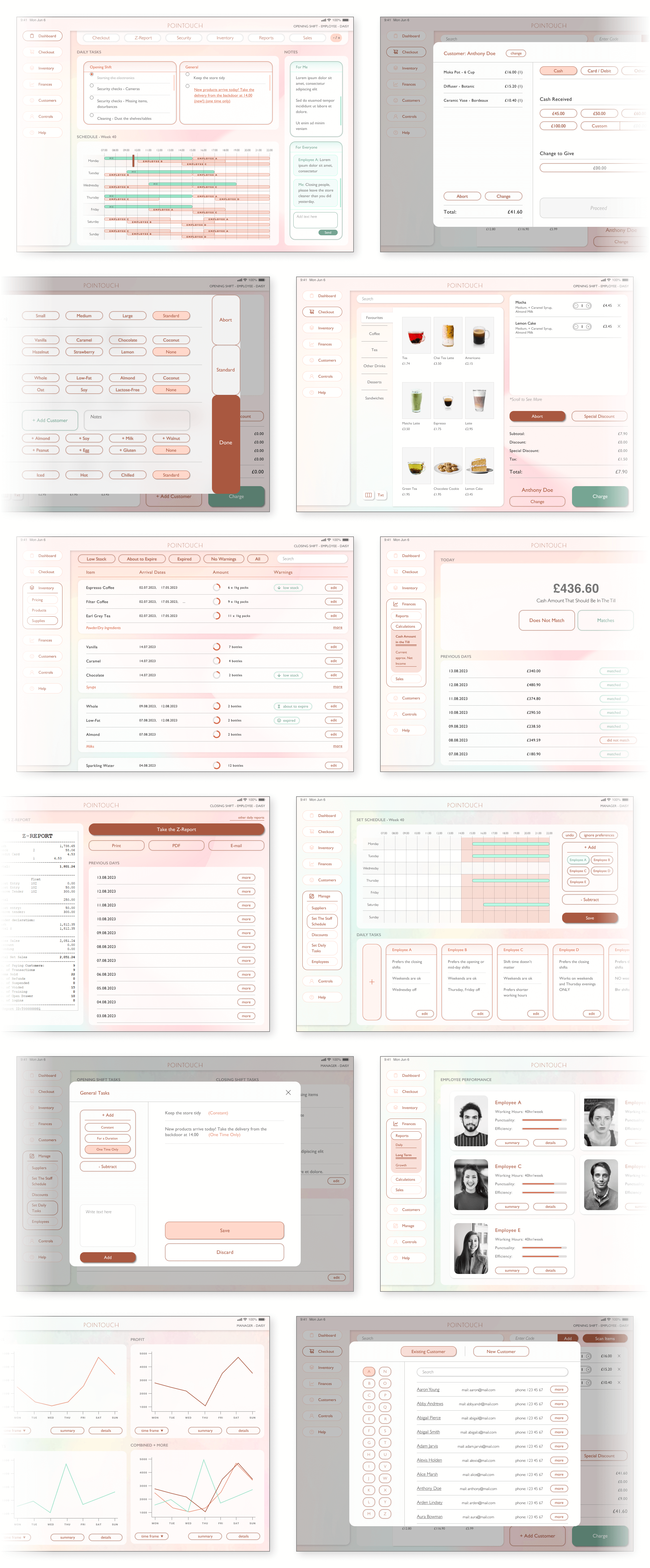
The goal of the high-fidelity design was to maximize efficiency and ensure employee satisfaction. This was done through elevations, colours/high contrasts between colours, user-friendly motions and so on. The general vibe of a calm and cosy environment was the idea, very much like a cosy game. This was because I wanted the employees to feel like their work was a cozy fun game.
Mockups
For the mockup design, I focused on elevations and colours. Elevations included shadows, transparency, blur, and overlays. These features separated sections, indicated active areas, and created an overall seamless experience. I used calming pinks and beiges that are needed for this fast-paced and stressful work environment. I used an accent colour, that is opposite on the colour wheel from the main colours, for important elements. The background image for the manager's frames was distinct to emphasise the distinction and avoid possible mix-ups.
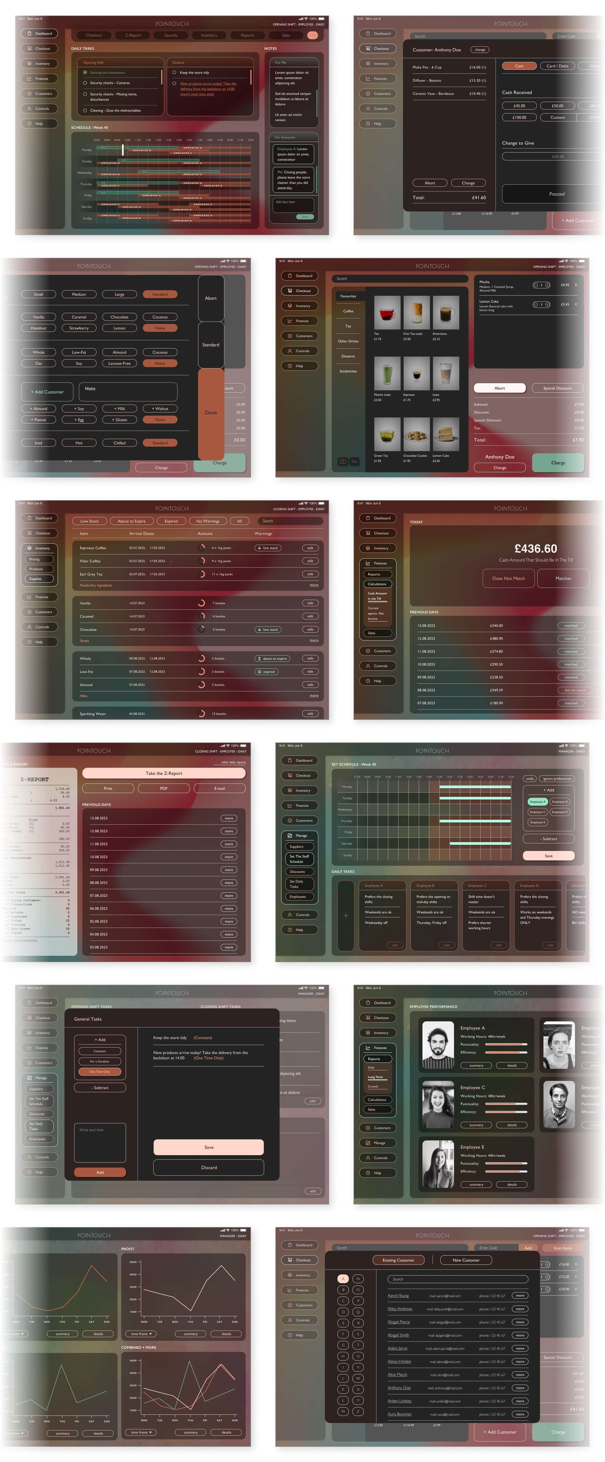
The Dark Mode.
It is widely known that many people prefer the dark mode of an interface. This is mainly because it is easier on the eyes and does not strain them as much, which is great for our users who need to look at the screen for extended periods. Also, some people simply like the way it looks. In conclusion, I have decided to include a dark mode option for anyone who prefers it.
High Fidelity Prototype
Some of the changes done after the usability study would be best displayed in motion, in the form of a prototype. For example, in the setting schedule part of the fourth prototype, the editing of a time frame was shown in continuous motion, portraying the process much better than the still images. It is also good to see the contrast of the colours in a dynamic setting.
The first prototype showcases the following flows of the opening shift:
- Logging in,
- Crossing done tasks,
- Checking security.
The second prototype showcases the following flows of the checking out process for the retail store:
- Adding a product to the checkout list from the menu, by searching and scanning,
- Choosing the customer from saved customers,
- Charging (receiving money and giving change and the receipt).
The third prototype showcases the following flows of the checking out process for the coffee shop:
- Choosing and customizing a coffee order and adding it to the checkout list,
- Adding a food item to the checkout list,
- Charging (receiving money and giving change and the receipt).
The fourth prototype showcases the following flows of the closing shift for the coffee shop (Notice if the task is done on the software it automatically marks it down in the to-do list):
- Taking the inventory (marking down finished supplies, throwing out expired products),
- Checking if the amount in the till matches with the amount the POS system calculated,
- Taking the Z-report.
The fourth prototype showcases the following flows of setting weekly staff schedules for the manager:
- Adding the time frames of employee 1,
- Adding the time frames of employee 2 (partly, it would take a lot of time to do all the scheduling for the test group).
The fifth prototype showcases the following flows of some other duties of the manager:
- Setting a one-time-only task for the day,
- Set a discount amount for a product,
- Viewing employee performances,
- Looking at the growth reports,
- Placing orders for low-stock items.
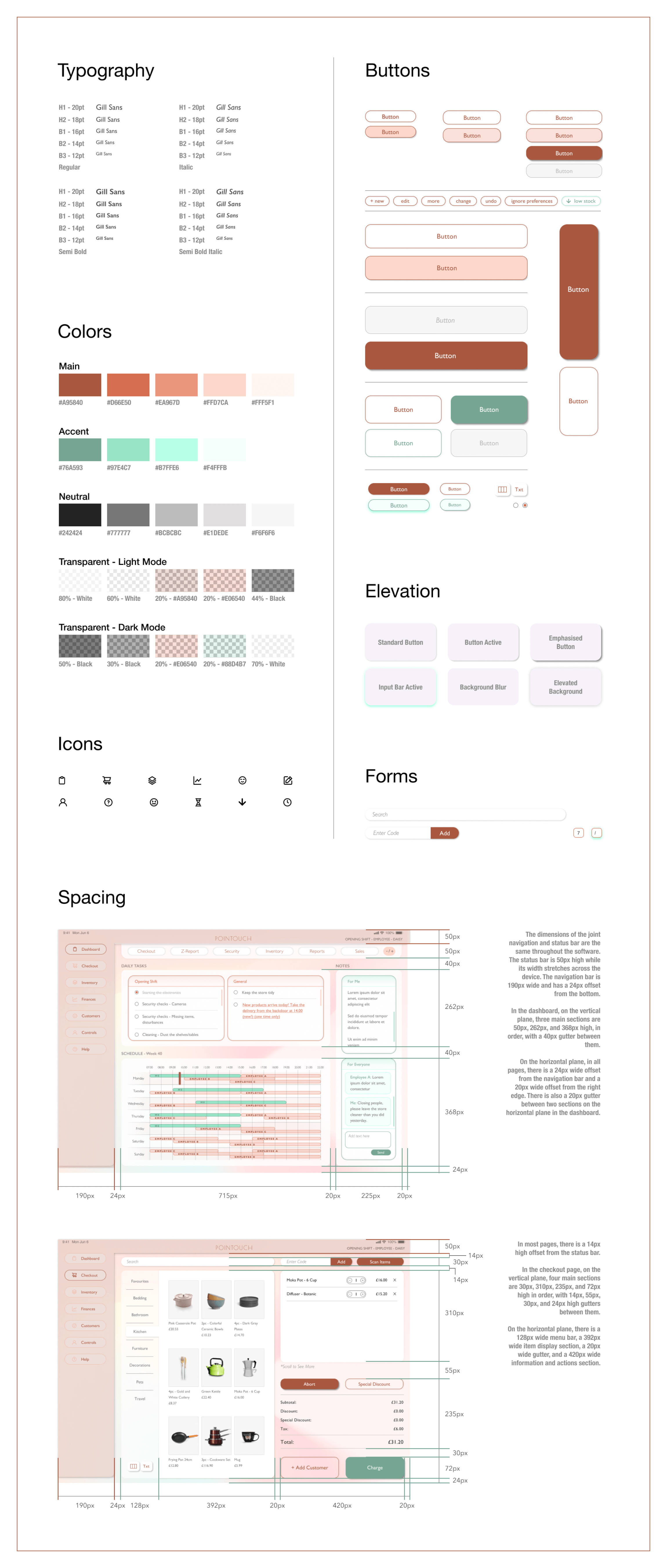
Design System
made by M. Dilara Özdemir
with love